Spark accumulates the total volume and trades times at each price level and plots a market profile chart.
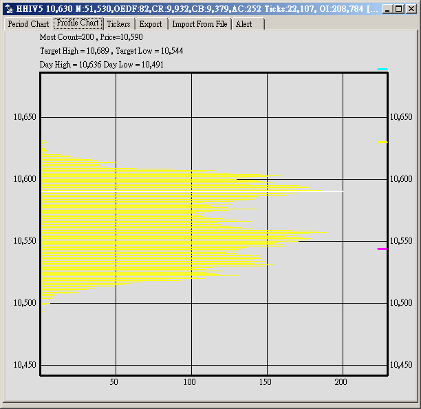
The bottom axis is the unique traded times (not volume) at a particular price level.
The longest line is colored in white, indicating the most traded price level.
See next feature: Bough/Sold Volume Chart
如欲免費試用, 請寄 電郵 給我們 或 whatsapp 3502 1457 或加我們LINE.
Line ID : spark-spapi